24. matplotlib.pyplot 1부#
기본 설정
import numpy as np
맷플롯립Matplotlib은 간단한 그래프 도구를 제공하는 라이브러리다.
맷플롯립의 대부분의 함수는 파이플롯pyplot 모듈에 포함되어 있으며
관행적으로 plt 별칭으로 불러온다.
import matplotlib.pyplot as plt
24.1. plot() 함수#
선분 그리기
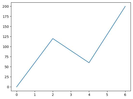
2차원 평면의 두 점이 주어졌을 때 두 점을 잇는 선분을 그린다. 두 점의 좌표는 x 축 기준으로 두 개의 값을, y 축 기준으로 두 개의 값을 지정하면 순서대로 쌍을 지어 사용된다.
예를 들어 (0, 0), (2, 100), (4, 60), (5, 200) 네 점을 잇는 선분을 그리려면
다음처럼 [0, 2, 4, 6] 를 x 좌표들의 어레이로,
[0, 100, 60, 200] 을 y 자표들의 어레이로 선언하고
plot() 함수의 두 인자로 지정한다.
xpoints = np.array([0, 2, 4, 6])
ypoints = np.array([0, 120, 60, 200])

plt.plot(xpoints, ypoints)
plt.show()
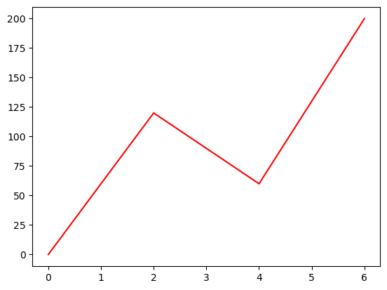
선분 색깔을 빨강으로 바꾸려면 셋째 인자로 'r' 을 사용한다.
xpoints = np.array([0, 2, 4, 6])
ypoints = np.array([0, 120, 60, 200])

plt.plot(xpoints, ypoints, 'r')
plt.show()
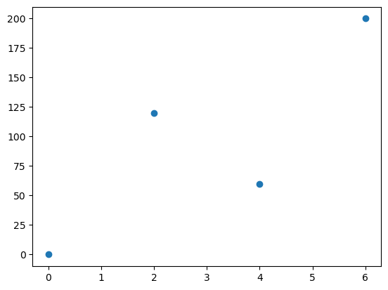
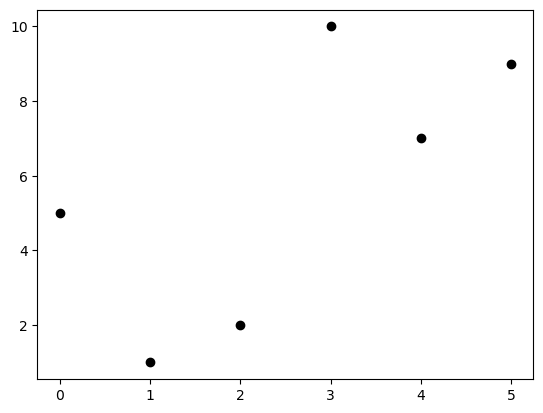
점만 그리기
두 점을 잇는 선분을 그리지 않으려면 셋째 인자로 'o' 를 지정한다.
xpoints = np.array([0, 2, 4, 6])
ypoints = np.array([0, 120, 60, 200])

plt.plot(xpoints, ypoints, 'o')
plt.show()
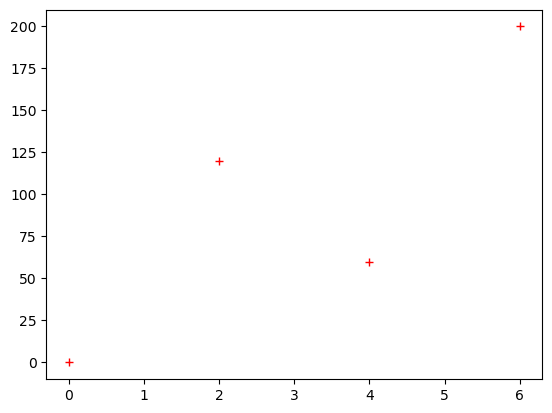
빨간 덧셈 기호로 표기하고 싶으면 r+ 를 셋째 인자로 사용한다.
xpoints = np.array([0, 2, 4, 6])
ypoints = np.array([0, 120, 60, 200])

plt.plot(xpoints, ypoints, '+r')
plt.show()
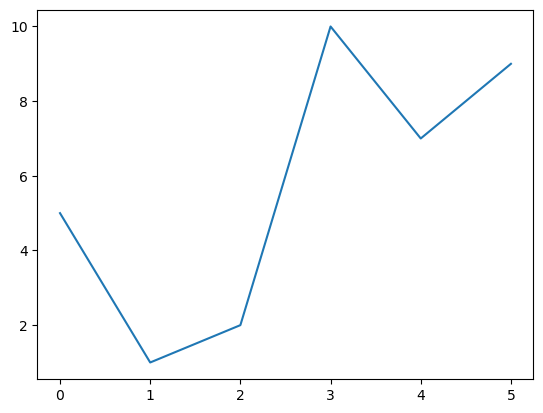
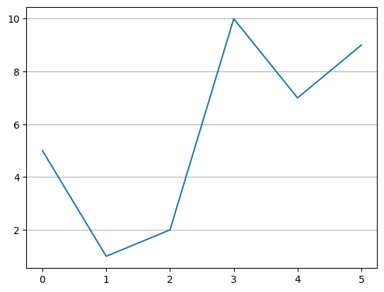
x-좌표 생략하기
x 좌표를 생략할 수 있다. 그러면 y 좌표에 사용된 개수만큼의 인덱스가 자동으로 x 좌표로 사용된다.
ypoints = np.array([5, 1, 2, 10, 7, 9])

plt.plot(ypoints)
plt.show()
그래프를 많이 그리면 메모리에 부담을 준다. 따라서 종종 불필요한 그래프를 메모리에서 삭제해주는 게 좋다. 아래 코드는 모든 그래프를 메모리에서 삭제한다.
plt.close('all')
24.2. 마커#
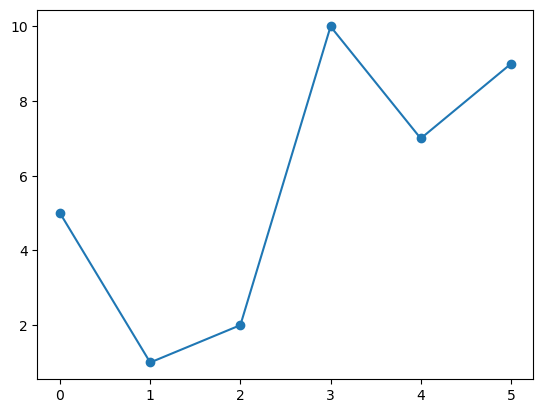
각 점을 강조하기 위해 모양을 지정하고 싶을 때 marker 옵션 인자를 사용한다.
예를 들어, 작은 원으로 각 점을 표시하고 싶으면 market='o' 로 지정한다.
ypoints = np.array([5, 1, 2, 10, 7, 9])

plt.plot(ypoints, marker='o')
plt.show()
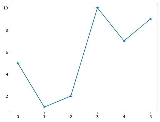
별표를 사용하려면 marker='*' 를 사용한다.
ypoints = np.array([5, 1, 2, 10, 7, 9])

plt.plot(ypoints, marker='*')
plt.show()
마커 종류
다양한 종류의 마커marker가 제공된다. 그중 일부는 다음과 같다.
마커 |
기호 |
|---|---|
|
● |
|
· |
|
⬤ |
|
▼ |
|
▲ |
|
◀ |
|
▶ |
선-마커 형식 문자열
점 모양, 선분 사용 여부 등을 한꺼번에 지정할 수 있다.
예를 들어, 빨간 점을 잇는 선분을 사용하려면 셋째 인자로 선과 마커의 속성을 지정하는
형식 문자열로 o-r 을 사용한다.
ypoints = np.array([5, 1, 2, 10, 7, 9])

plt.plot(ypoints, 'o-r')
plt.show()
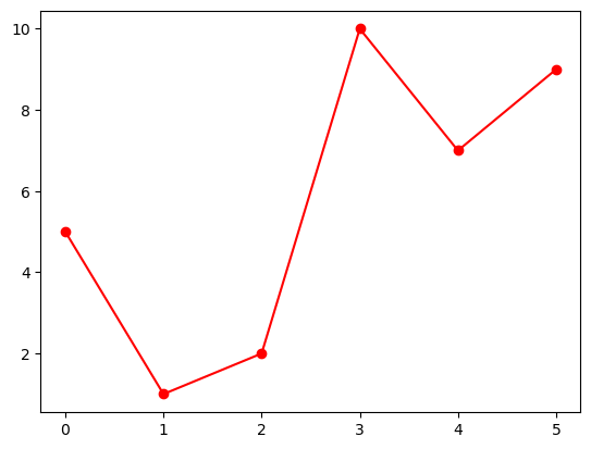
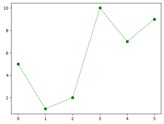
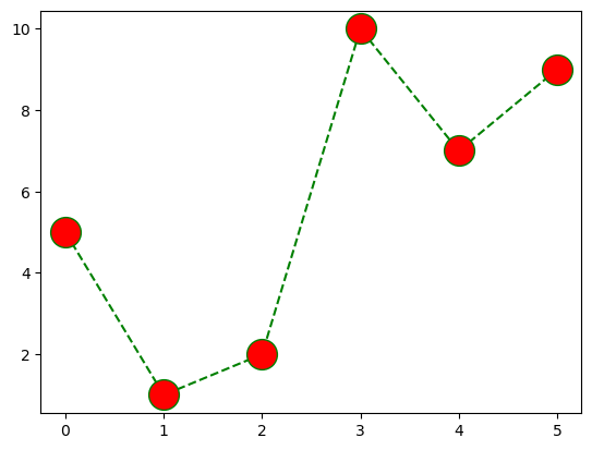
초록 점선을 사용하려면 형식 문자열 o:g 를 셋째 인자로 사용한다.
ypoints = np.array([5, 1, 2, 10, 7, 9])

plt.plot(ypoints, 'o:g')
plt.show()
형식 문자열은 세 개의 요소로 구성되며, 각 요소는 생략될 수 있다.
점 모양
선분 모양
색
점 모양은 앞서 소개한 마커marker에 의해 정해진다. 지정되지 않으면 점이 표기되지 않는다.
선분 모양
선 모양은 다음 중 하나를 선택한다. 지정되지 않으면 선이 그려지지 않는다.
선 기호 |
선 모양 |
|---|---|
‘-’ |
실선 |
‘:’ |
점선 |
‘–’ |
파선 |
‘-.’ |
1점 쇄선 |
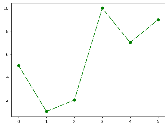
ypoints = np.array([5, 1, 2, 10, 7, 9])

plt.plot(ypoints, 'ok')
plt.show()
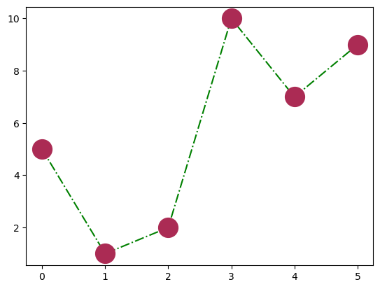
1점 쇄선은 아래 모양이다.
ypoints = np.array([5, 1, 2, 10, 7, 9])

plt.plot(ypoints, 'o-.g')
plt.show()
색 선택
색은 다음 중 하나를 선택한다. 생략되면 파랑이 기본값으로 사용된다.
색 기호 |
색 |
|---|---|
‘r’ |
빨강 |
‘g’ |
초록 |
‘b’ |
파랑 |
‘c’ |
청록 |
‘m’ |
심홍 |
‘y’ |
노랑 |
‘k’ |
검정 |
‘w’ |
하양 |
마커 크기
마커의 크기는 markersize 또는 ms 옵션 인자로 지정한다.
ypoints = np.array([5, 1, 2, 10, 7, 9])

plt.plot(ypoints, 'o--g', ms=20)
plt.show()

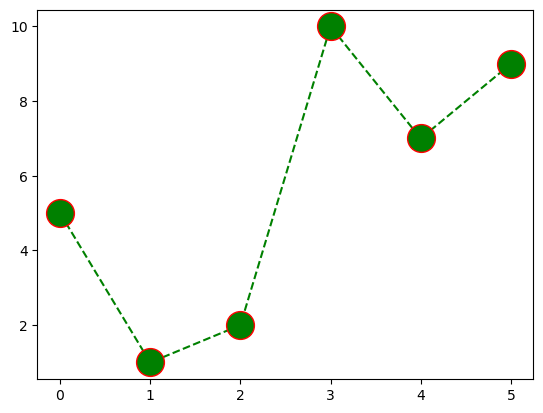
마커 테두리 색
마커의 테두리 색을 markeredgecolor 또는 mec 옵션 인자로 지정한다.
ypoints = np.array([5, 1, 2, 10, 7, 9])

plt.plot(ypoints, 'o--g', ms=20, mec='r')
plt.show()
마커 내부 색
마커의 내부의 색을 markerfacecolor 또는 mfc 옵션 인자로 지정한다.
ypoints = np.array([5, 1, 2, 10, 7, 9])

plt.plot(ypoints, 'o--g', ms=20, mfc='r')
plt.show()
마커 색
mec 와 mfc 인자를 동일한 값으로 지정하면 마커의 색을 선분의 색과 다르게 지정할 수 있다.
ypoints = np.array([5, 1, 2, 10, 7, 9])

plt.plot(ypoints, 'o--g', ms=20, mfc='r', mec='r')
plt.show()

헥스 코드 활용
색을 지정하기 위해 헥스 코드를 사용할 수 있다.
ypoints = np.array([5, 1, 2, 10, 7, 9])

plt.plot(ypoints, 'o-.g', ms=20, mfc='#ab2b54', mec='#ab2b54')
plt.show()
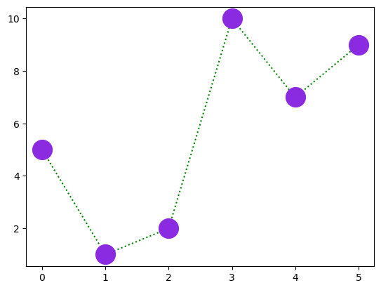
색 이름 활용
140개의 색 이름을 직접 사용할 수 있다.
ypoints = np.array([5, 1, 2, 10, 7, 9])

plt.plot(ypoints, 'o:g', ms=20, mfc='blueviolet', mec='blueviolet')
plt.show()
plt.close('all')
24.3. 선분#
linestyle 또는 ls 옵션 인자로 선 모양을 지정할 수 있다.
앞서 언급한 선 기호를 사용하거나 다음 문자열 중에 하나를 사용한다.
선 기호 |
문자열 |
|---|---|
‘-’ |
‘solid’ |
‘:’ |
‘dotted’ |
‘–’ |
‘dashed’ |
‘-.’ |
‘dashdot |
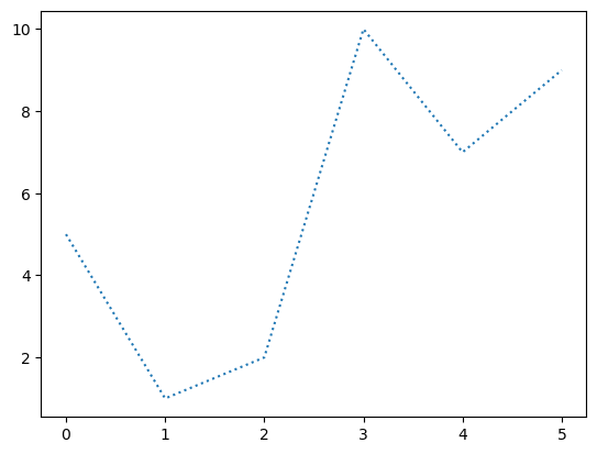
ypoints = np.array([5, 1, 2, 10, 7, 9])

plt.plot(ypoints, ls='dotted')
plt.show()
선 색깔
color 또는 c 옵션 인자로 선의 색을 지정하며,
인자로 사용되는 값은 앞서 마커의 색에서 설명한 방식과 동일하게 지정한다.
선 두께
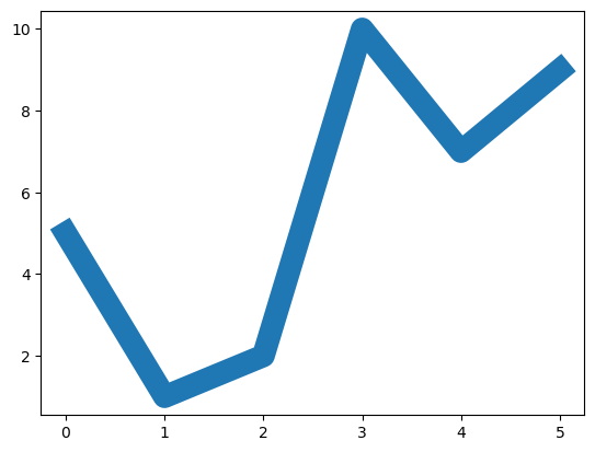
linewidth 또는 lw 옵션 인자로 선의 두께를 지정한다.
ypoints = np.array([5, 1, 2, 10, 7, 9])

plt.plot(ypoints, ls='solid', lw='15')
plt.show()
여러 개의 선 그리기
plt.plot() 함수를 여러 번 호출하면 여러 개의 선이 그려진다.
단. plt.show() 함수를 항상 맨 나중에 호출해야 한다.
선들을 구분하기 위해 자동으로 다른 색이 사용된다.
물론 선의 색을 따로따로 지정할 수도 있다.
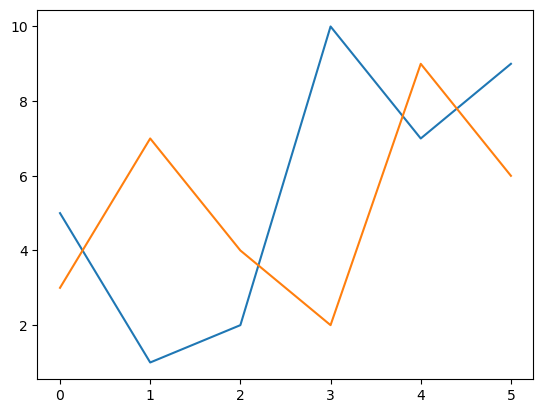
y1 = np.array([5, 1, 2, 10, 7, 9])
y2 = np.array([3, 7, 4, 2, 9, 6])

plt.plot(y1)
plt.plot(y2)

plt.show()
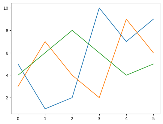
두 개 이상의 선을 함께 그릴 수도 있다.
y1 = np.array([5, 1, 2, 10, 7, 9])
y2 = np.array([3, 7, 4, 2, 9, 6])
y3 = np.array([4, 6, 8, 6, 4, 5])

plt.plot(y1)
plt.plot(y2)
plt.plot(y3)

plt.show()
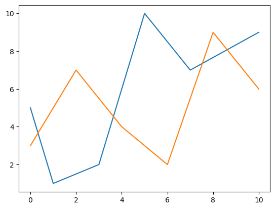
각 선의 x 좌표가 다르다면 아래 방식으로 지정한다.
x1 = np.array([0, 1, 3, 5, 7, 10])
y1 = np.array([5, 1, 2, 10, 7, 9])
x2 = np.array([0, 2, 4, 6, 8, 10])
y2 = np.array([3, 7, 4, 2, 9, 6])

plt.plot(x1, y1, x2, y2)

plt.show()
plt.close('all')
24.4. 라벨과 제목#
축 라벨
plt.xlabel(), plt.ylabel() 함수를 이용하여
x 축, y 축에 표시 라벨을 붙일 수 있다.
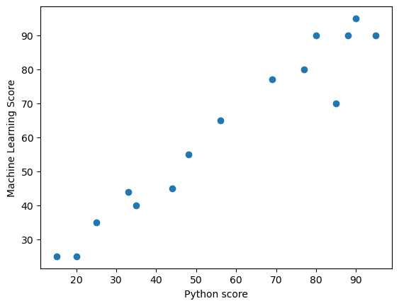
아래 그래프는 파이썬 점수와 머신러닝 점수 사이의 연관성을 보여준다.
x = np.array([25, 80, 85, 35, 48, 90, 95, 77, 88, 56, 15, 20, 33, 69, 44])
y = np.array([35, 90, 70, 40, 55, 95, 90, 80, 90, 65, 25, 25, 44, 77, 45])

plt.xlabel("Python score")
plt.ylabel("Machine Learning Score")

plt.plot(x, y, 'o')

plt.show()
한글 라벨과 타이틀
한글 라벨을 사용하려면 시스템에 폰트 설치 등 추가 설정을 해야 한다. 하지만 여기서는 사용하지 않는다. 자세한 설정법은 matplotlib에서 한글 지원하기를 참고할 수 있다.
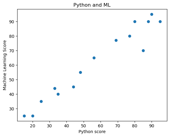
그래프 제목
plt.tittle() 함수를 이용하여 그래프에 제목을 추가할 수 있다.
x = np.array([25, 80, 85, 35, 48, 90, 95, 77, 88, 56, 15, 20, 33, 69, 44])
y = np.array([35, 90, 70, 40, 55, 95, 90, 80, 90, 65, 25, 25, 44, 77, 45])

plt.xlabel("Python score")
plt.ylabel("Machine Learning Score")
plt.title("Python and ML")

plt.plot(x, y, 'o')

plt.show()
글자 크기, 색, 글꼴
라벨과 타이틀의 글자 설정을 fontdict 옵션인자를 이용하여 지정할 수 있다.
단, 사전 자료형을 이용한다.
x = np.array([25, 80, 85, 35, 48, 90, 95, 77, 88, 56, 15, 20, 33, 69, 44])
y = np.array([35, 90, 70, 40, 55, 95, 90, 80, 90, 65, 25, 25, 44, 77, 45])

font1 = {'family':'serif','color':'blue','size':20}
font2 = {'family':'serif','color':'darkred','size':14}

plt.xlabel("Python score", fontdict=font2)
plt.ylabel("Machine Learning Score", fontdict=font2)
plt.title("Python and ML", fontdict=font1)

plt.plot(x, y, 'o')
[<matplotlib.lines.Line2D at 0x1c8de207fd0>]
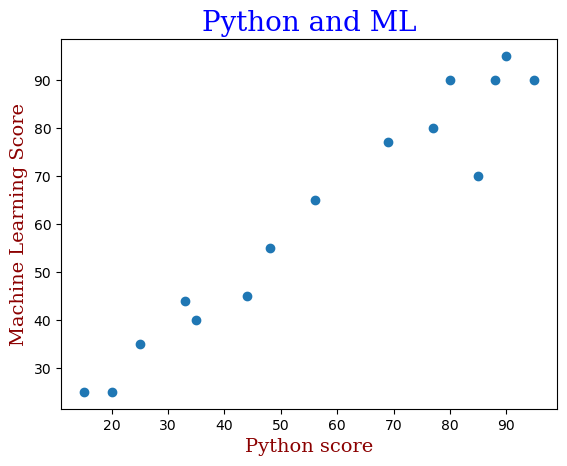
plt.show()
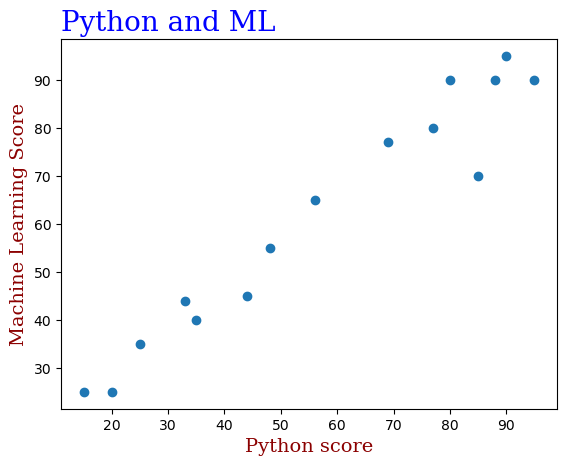
타이틀 위치
loc 옵션인자를 이용하여 타이의 위치를 왼쪽(left), 오른쪽(right),
또는 중앙(center)에 위치시킬 수 있다. 기본값은 중앙이다.
x = np.array([25, 80, 85, 35, 48, 90, 95, 77, 88, 56, 15, 20, 33, 69, 44])
y = np.array([35, 90, 70, 40, 55, 95, 90, 80, 90, 65, 25, 25, 44, 77, 45])

font1 = {'family':'serif','color':'blue','size':20}
font2 = {'family':'serif','color':'darkred','size':14}

plt.xlabel("Python score", fontdict=font2)
plt.ylabel("Machine Learning Score", fontdict=font2)
plt.title("Python and ML", fontdict=font1, loc='left')

plt.plot(x, y, 'o')

plt.show()
범례
그래프에 사용된 데이터의 정보를 범례legend 로 전달할 수 있다.
이를 위해 plot() 함수에 label 옵션 인자를 사용한다.
y1 = np.array([5, 1, 2, 10, 7, 9])
y2 = np.array([3, 7, 4, 2, 9, 6])
y3 = np.array([4, 6, 8, 6, 4, 5])

plt.plot(y1, label='Python') # 범례에 사용된 라벨 지정
plt.plot(y2, label='ML')
plt.plot(y3, label='DL')
plt.legend() # 범례 설정

plt.xlabel("Counts", fontdict=font2)
plt.ylabel("Scores", fontdict=font2)
plt.title("Data Analysis", fontdict=font1)

plt.show()
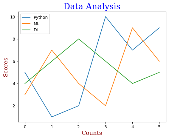
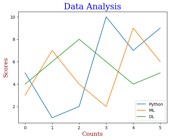
범례는 적절한 곳에 자동으로 위치하지만,
loc 옵션 인자 다음 중 하나를 선택하여 위치를 지정할 수도 있다.
문자열 또는 코드를 사용한다.
위치 문자열 |
위치 코드 |
|---|---|
‘best’ |
0 |
‘upper right’ |
1 |
‘upper left’ |
2 |
‘lower left’ |
3 |
‘lower right’ |
4 |
‘right’ |
5 |
‘center left’ |
6 |
‘center right’ |
7 |
‘lower center’ |
8 |
‘upper center’ |
9 |
‘center’ |
10 |
y1 = np.array([5, 1, 2, 10, 7, 9])
y2 = np.array([3, 7, 4, 2, 9, 6])
y3 = np.array([4, 6, 8, 6, 4, 5])

plt.plot(y1, label='Python') # 범례에 사용된 라벨 지정
plt.plot(y2, label='ML')
plt.plot(y3, label='DL')
plt.legend(loc='lower right') # 범례 설정

plt.xlabel("Counts", fontdict=font2)
plt.ylabel("Scores", fontdict=font2)
plt.title("Data Analysis", fontdict=font1)

plt.show()
plt.close('all')
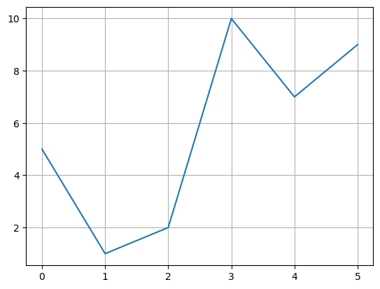
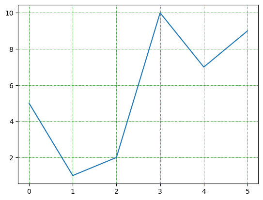
24.5. 격자 무늬 배경#
격자 무늬를 그래프의 배경에 넣기 위해 plt.grid() 함수를 사용한다.
ypoints = np.array([5, 1, 2, 10, 7, 9])

plt.plot(ypoints)
plt.grid()

plt.show()
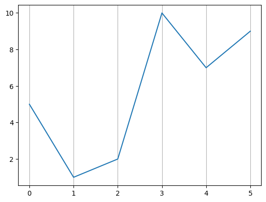
축을 지정하여 격자를 선택할 수 있다.
ypoints = np.array([5, 1, 2, 10, 7, 9])

plt.plot(ypoints)
plt.grid(axis='x')

plt.show()
ypoints = np.array([5, 1, 2, 10, 7, 9])

plt.plot(ypoints)
plt.grid(axis='y')

plt.show()
격자 무늬의 선 속성을 그래프의 선 속성과 유사한 방식으로 변경할 수 있다.
ypoints = np.array([5, 1, 2, 10, 7, 9])

plt.plot(ypoints)
plt.grid(color = 'green', linestyle = '-.', linewidth = 0.5)

plt.show()
plt.close('all')
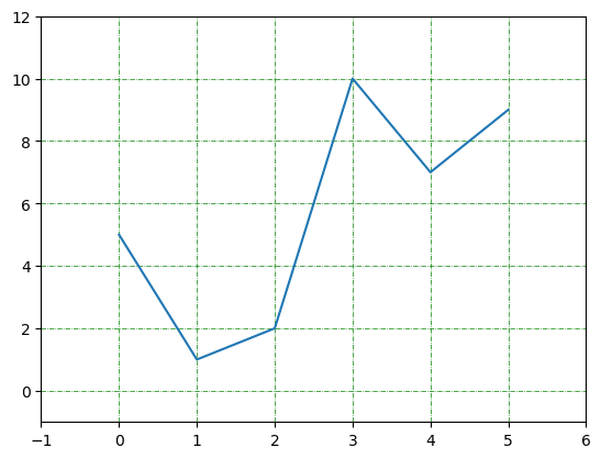
24.6. 축의 범위와 척도#
x 축, y 축의 범위와 척도는 plt.plot() 함수가 데이터에 맞춰 자동으로 지정한다.
하자민 경우에 따라 범위와 척도를 수동으로 지정해야할 때가 있다.
범위 지정
plt.axis() 함수를 이용한다.
함수의 인자로 길이가 4인 리스트를 인자로 받으며
x 축의 최솟값, 최댓값,
y 축의 최솟값, 최댓값
순서로 리스트의 항목을 사용한다.
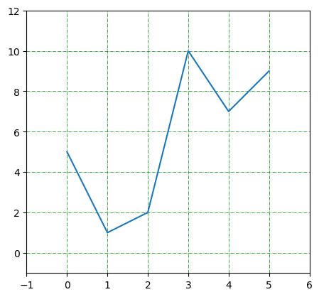
ypoints = np.array([5, 1, 2, 10, 7, 9])

plt.plot(ypoints)
plt.grid(color = 'green', linestyle = '-.', linewidth = 0.5)
plt.axis([-1, 6, -1, 12])

plt.show()
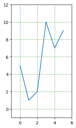
척도 지정
x 축과 y 축에 사용되는 척도를 통일시킬 수 있다.
plt.gca().set_aspect() 함수의 인자로 "equal" 을 사용하면 된다.
plt.gca() 함수는 현재 이미지에 사용된 축의 인스턴스를 생성한다.
ypoints = np.array([5, 1, 2, 10, 7, 9])

plt.plot(ypoints)
plt.grid(color = 'green', linestyle = '-.', linewidth = 0.5)

plt.axis([-1, 6, -1, 12])
plt.gca().set_aspect("equal")

plt.show()
x 축에 대한 y 축의 척도 비율을 함수의 인자로 지정할 수 있다. 예를 들어 0.5 는 x 축 상에서의 1에 해당하는 길이가 y 축 상에서는 0.5에 해당한다는 의미다.
ypoints = np.array([5, 1, 2, 10, 7, 9])

plt.plot(ypoints)
plt.grid(color = 'green', linestyle = '-.', linewidth = 0.5)

plt.axis([-1, 6, -1, 12])
plt.gca().set_aspect(0.5)

plt.show()

plt.close('all')
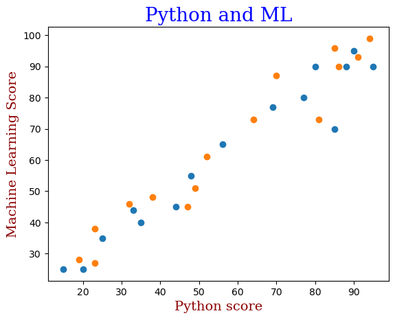
24.7. 산점도#
산점도는 데이터의 분포를 표현할 때 사용된다. 예를 들어, 아래 그래프는 파이썬 점수가 높으면 머신러닝 점수도 높아짐을 산점도를 통해 보여준다.
x = np.array([25, 80, 85, 35, 48, 90, 95, 77, 88, 56, 15, 20, 33, 69, 44])
y = np.array([35, 90, 70, 40, 55, 95, 90, 80, 90, 65, 25, 25, 44, 77, 45])

font1 = {'family':'serif','color':'blue','size':20}
font2 = {'family':'serif','color':'darkred','size':14}

plt.xlabel("Python score", fontdict=font2)
plt.ylabel("Machine Learning Score", fontdict=font2)
plt.title("Python and ML", fontdict=font1)

plt.scatter(x, y)

plt.show()
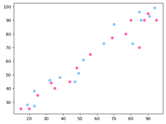
여러 개의 산점도
plt.plot() 함수처럼 여러 데이터의 산점도를 동시에 그릴 수 있으며
자동으로 다른 색깔로 표시된다.
예를 들어, 다른 반의 파이썬 점수와 머신러닝 점수 데이터를 추가해보자.
# A 반 성적
xa = np.array([25, 80, 85, 35, 48, 90, 95, 77, 88, 56, 15, 20, 33, 69, 44])
ya = np.array([35, 90, 70, 40, 55, 95, 90, 80, 90, 65, 25, 25, 44, 77, 45])
plt.scatter(xa, ya)

# B 반 성적
xb = np.array([23, 85, 81, 38, 49, 94, 91, 70, 86, 52, 19, 23, 32, 64, 47])
yb = np.array([38, 96, 73, 48, 51, 99, 93, 87, 90, 61, 28, 27, 46, 73, 45])
plt.scatter(xb, yb)

font1 = {'family':'serif','color':'blue','size':20}
font2 = {'family':'serif','color':'darkred','size':14}

plt.xlabel("Python score", fontdict=font2)
plt.ylabel("Machine Learning Score", fontdict=font2)
plt.title("Python and ML", fontdict=font1)

plt.show()
색 지정
산점도의 색은 plt.scatter() 함수의 color 옵션 인자로 지정한다.
# A 반 성적
xa = np.array([25, 80, 85, 35, 48, 90, 95, 77, 88, 56, 15, 20, 33, 69, 44])
ya = np.array([35, 90, 70, 40, 55, 95, 90, 80, 90, 65, 25, 25, 44, 77, 45])
plt.scatter(xa, ya, color='hotpink')

# B 반 성적
xb = np.array([23, 85, 81, 38, 49, 94, 91, 70, 86, 52, 19, 23, 32, 64, 47])
yb = np.array([38, 96, 73, 48, 51, 99, 93, 87, 90, 61, 28, 27, 46, 73, 45])
plt.scatter(xb, yb, color='#8fc9ff')

plt.show()
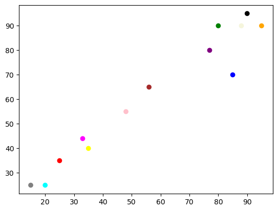
각 점에 대해서도 색을 지정할 수 있다. 단, 각 점에 대해 색을 리스트 어레이 형식으로 지정해야 한다.
x = np.array([25, 80, 85, 35, 48, 90, 95, 77, 88, 56, 15, 20, 33])
y = np.array([35, 90, 70, 40, 55, 95, 90, 80, 90, 65, 25, 25, 44])

colors = np.array(["red","green","blue","yellow","pink","black","orange",
                   "purple","beige","brown","gray","cyan","magenta"])

plt.scatter(x, y, color=colors)

plt.show()
색지도
색지도colormap는 일종의 색 리스트다. 리스트에 포함된 색은 특정 온도를 가리키며, 온도는 0도에서 100도 사이를 움직인다. 즉, 0에서 100 사이의 값으로 이루어진 리스트가 색지도 역할을 수행한다.
그런데 색지도에 포함된 수가 가리키는 색은 선택된 색지도에 따라 다르다.
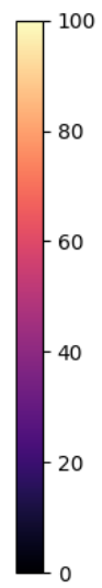
예를 들어 'magma' 색지도를 선택하면 각 수가 가리키는 색은 다음과 같다.
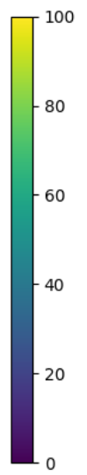
'viridis' 를 색지도로 선택하면 다음과 같은 색을 사용한다.
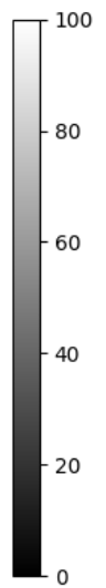
반면에 'gray' 는 흑백 색지도를 사용한다.
색지도 목록
제공되는 색지도의 목록은 Choosing Colormaps in Matplotlib에서 확인한다.
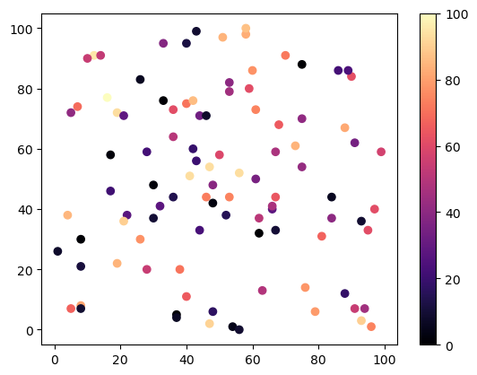
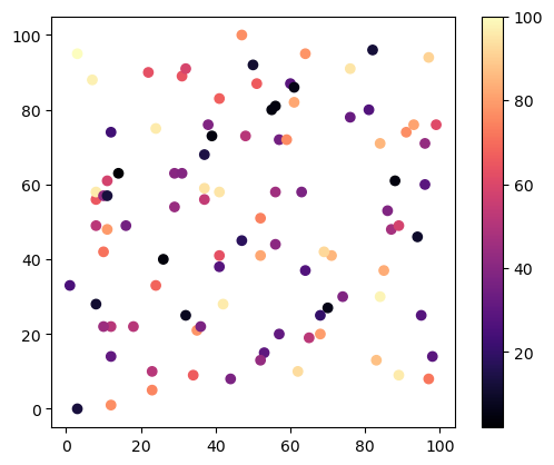
100개의 점과 100개의 색을 무작위로 선택한 다음
magma 색지도를 사용한 결과는 다음과 같다.
cmap='Pastel1': 색지도 선택plt.colorbar(): 색막대 표시
x = np.random.randint(101, size=(100,))
y = np.random.randint(101, size=(100,))
colors = np.random.randint(101, size=(100,))

plt.scatter(x, y, c=colors, cmap='magma')
plt.colorbar()

plt.show()
가로 세로 비율을 맞추면 좀 다르게 보인다.
x = np.random.randint(101, size=(100,))
y = np.random.randint(101, size=(100,))
colors = np.random.randint(101, size=(100,))

plt.scatter(x, y, c=colors, cmap='magma')
plt.colorbar()
plt.gca().set_aspect("equal") # 가로, 세로 비율 맞추기

plt.show()
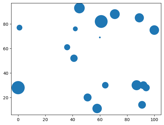
점 크기
점들의 크기를 지정할 수 있으며 s 옵션 인자를 활용한다.
np.random.seed(1000)

x = np.random.randint(101, size=(20,))
y = np.random.randint(101, size=(20,))
sizes = 10 * np.random.randint(100, size=(20,))

plt.scatter(x, y, s=sizes)

plt.show()
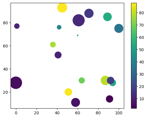
색지도와 혼용하면 많이 달라 보인다.
np.random.seed(1000)

x = np.random.randint(101, size=(20,))
y = np.random.randint(101, size=(20,))
sizes = 10 * np.random.randint(100, size=(20,))
colors = np.random.randint(101, size=(20,))

plt.scatter(x, y, c=colors, s=sizes, cmap='viridis')
plt.colorbar()

plt.show()
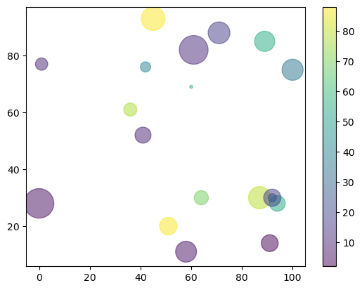
투명도
색의 투명도는 알파alpha 값을 조정한다.
np.random.seed(1000)

x = np.random.randint(101, size=(20,))
y = np.random.randint(101, size=(20,))
sizes = 10 * np.random.randint(100, size=(20,))
colors = np.random.randint(101, size=(20,))

plt.scatter(x, y, c=colors, s=sizes, cmap='viridis', alpha=0.5)
plt.colorbar()

plt.show()

plt.close('all')
plt.close("all")